top of page


VISUALISING DATA
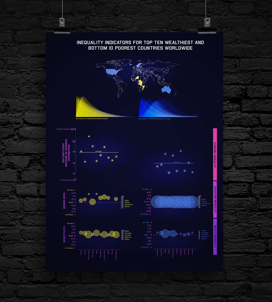
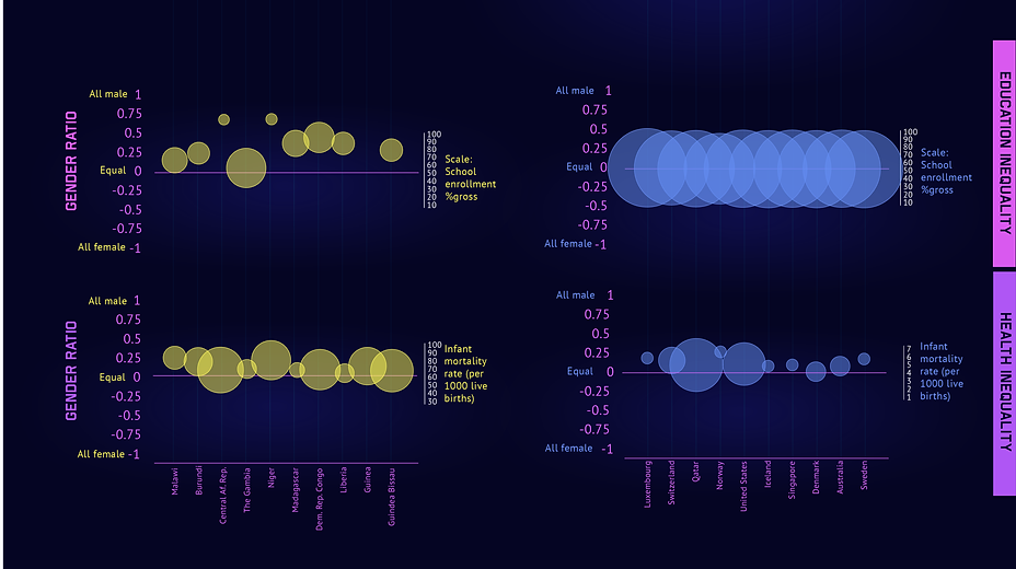
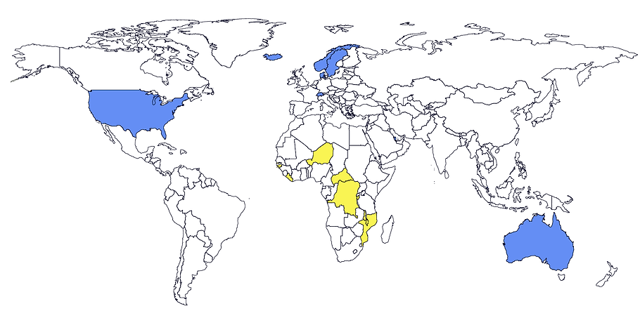
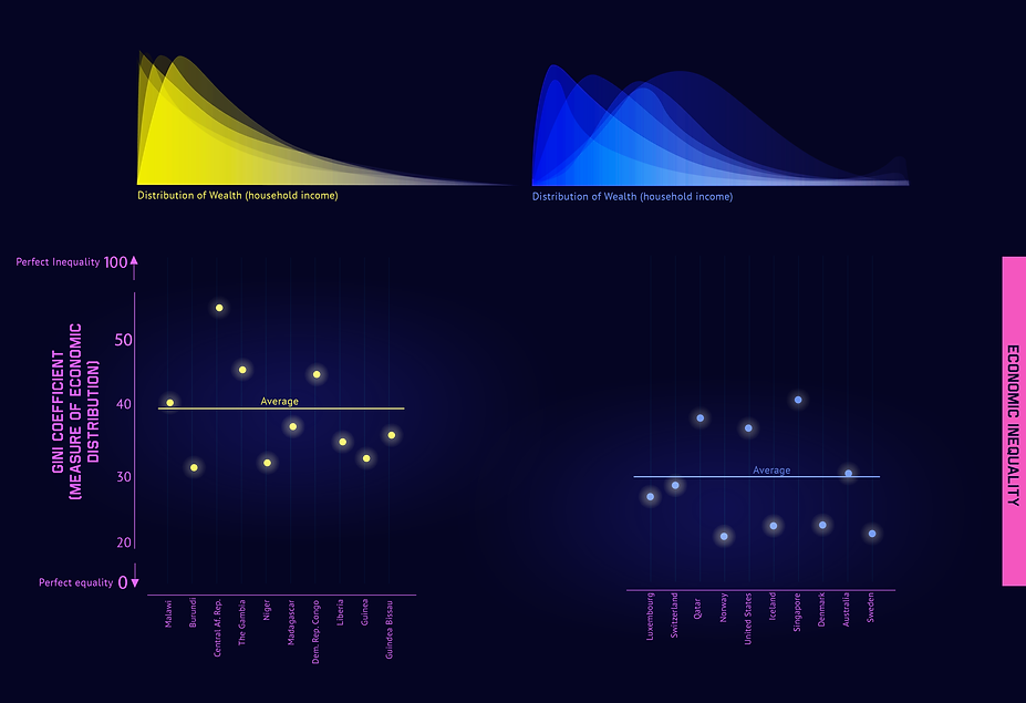
WHAT? Using datasets from The World Bank and UNICEF create graphics that visualise economic, health and education inequality in the world's top ten riches and bottom 10 poorest countries.
DESIGN BRIEF: Using the data illustrate inequality with a set of simple graphics that can be used both online and in print to engage with users.
bottom of page